
Advanced Custom Charts
CORAS SmartBoards support advanced custom chart types that go beyond standard bar and line charts — enabling the kind of specialized visualizations that mission decision-makers need. From Sankey diagrams that map funding flows to treemaps that show portfolio composition, these chart types transform raw data into visual intelligence. Gary can also create many of these visualizations on demand through natural language, generating charts in seconds that would take hours to build manually.
Why This Matters
Standard chart types cover most reporting needs. Advanced Custom Charts cover the rest — Sankey diagrams for funding flows, treemaps for portfolio composition, scorecards for leadership summaries. When the standard options don't fit the decision, this is where you go.
Vega-Lite is the specification language behind these charts. You don't need to know it deeply — the JSON examples in this article and in the Vega-Lite documentation give you a starting point you can modify for your data.
Gary can generate many of these chart types on demand through a conversation. If you want to explore what's possible before building a static chart, ask Gary first — see Gary Graphs for the full catalog.
Before You Start
You'll need a SmartBoard dashboard with a layout already configured. If you haven't done that yet, start with Build and Configure a SmartBoard.
Step 1: Add an Advanced Custom Chart to Your Dashboard
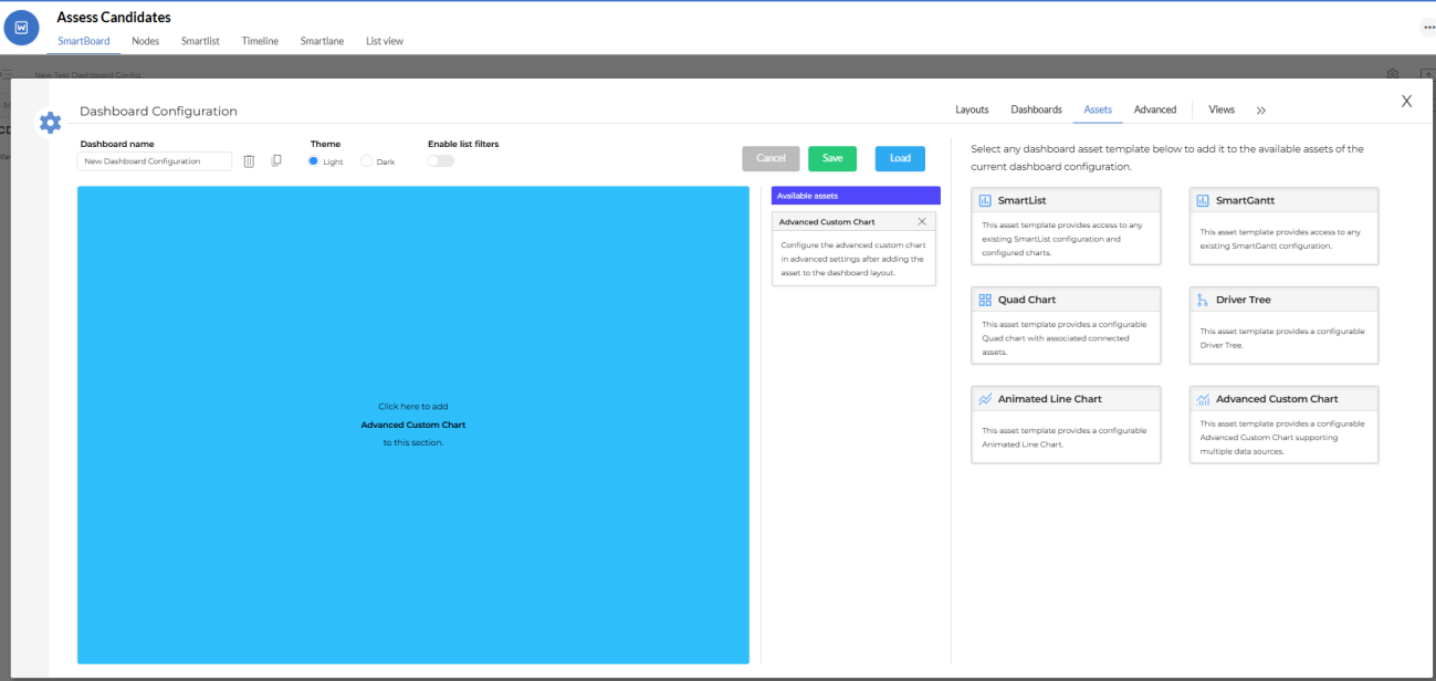
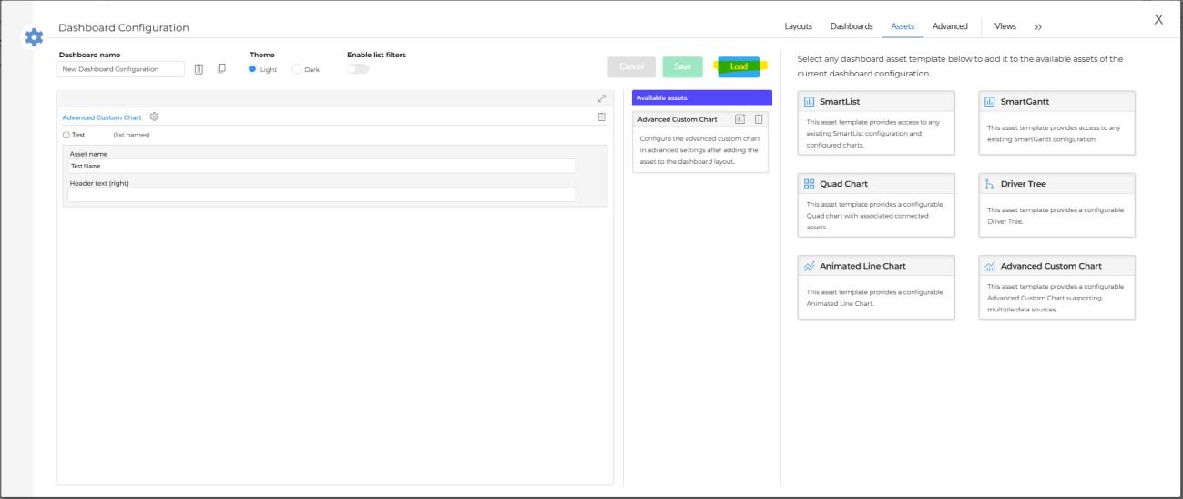
Open your SmartBoard and click the gear icon to open Dashboard Configuration
Select the Dashboards tab and open the dashboard you want to add the chart to
Go to the Assets tab
Select Advanced Custom Chart from the available asset templates
Select the layout box where the chart should appear
Step 2: Name the Asset and Open Configuration
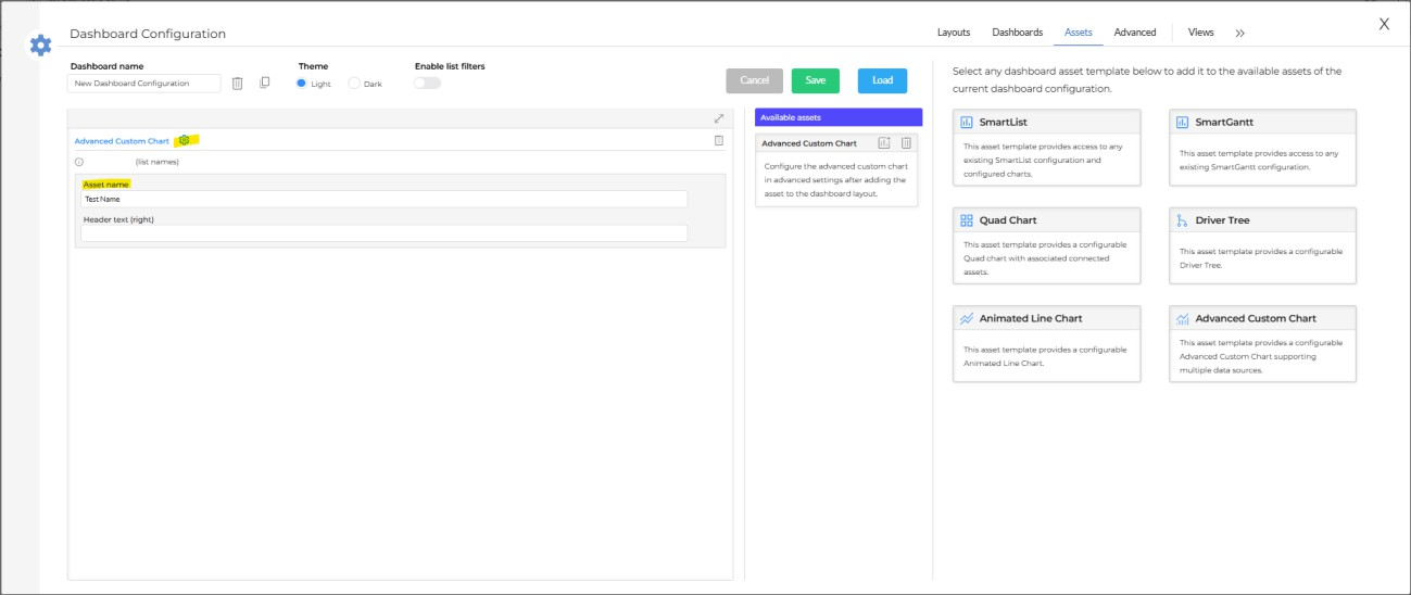
Enter a name for the chart asset
Click the gear icon next to the asset name to open the chart configuration panel
Step 3: Get Your Chart JSON
Go to Vega-Lite and find the chart type that fits your visualization need — or use the example JSON below as a starting point.
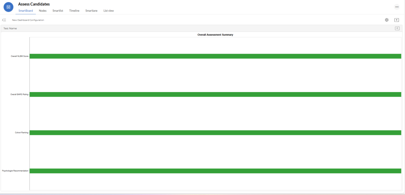
Example JSON - Program Assessment Summary
{
  "title": "Overall Assessment Summary",
  "width": 1200,
  "height": 120,
  "data": {
    "values": [
      {
        "metric": "Overall NLBM Score",
        "value": "84.5/100",
        "status": "Top 15% of cohort",
        "color": "#2ca02c"
      },
      {
        "metric": "Overall BARS Rating",
        "value": "4.52/5.00",
        "status": "Top 10% of cohort",
        "color": "#2ca02c"
      },
      {
        "metric": "Cohort Ranking",
        "value": "4 of 28",
        "status": "High Performer",
        "color": "#2ca02c"
      },
      {
        "metric": "Psychologist Recommendation",
        "value": "✓ READY FOR COMMAND",
        "status": "High Confidence",
        "color": "#2ca02c"
      }
    ]
  },
  "mark": {
    "type": "rect",
    "height": 25
  },
  "encoding": {
    "y": {
      "field": "metric",
      "type": "nominal",
      "axis": {
        "title": null,
        "labelLimit": 250
      },
      "sort": null
    },
    "color": {
      "field": "color",
      "type": "nominal",
      "scale": null,
      "legend": null
    },
    "tooltip": [
      {
        "field": "metric",
        "title": "Metric"
      },
      {
        "field": "value",
        "title": "Value"
      },
      {
        "field": "status",
        "title": "Status"
      }
    ]
  }
}
Step 4: Paste the JSON into the Chart Spec Window
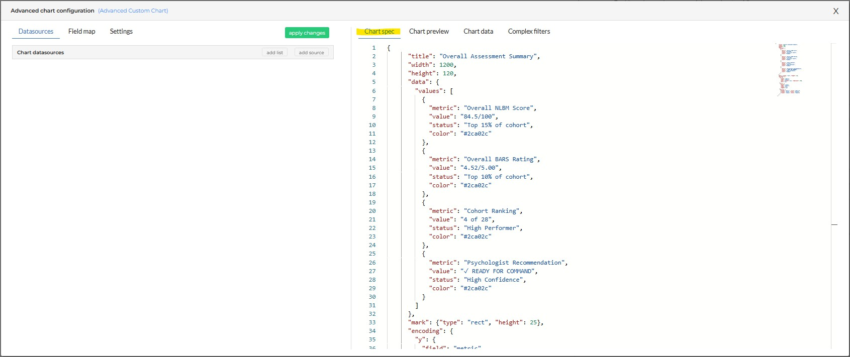
In the chart configuration panel, locate the Chart Spec window
Paste your complete JSON code into the Chart Spec window
Step 5: Copy the Values Array
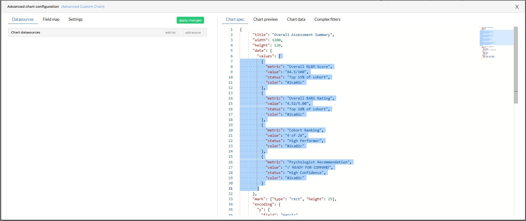
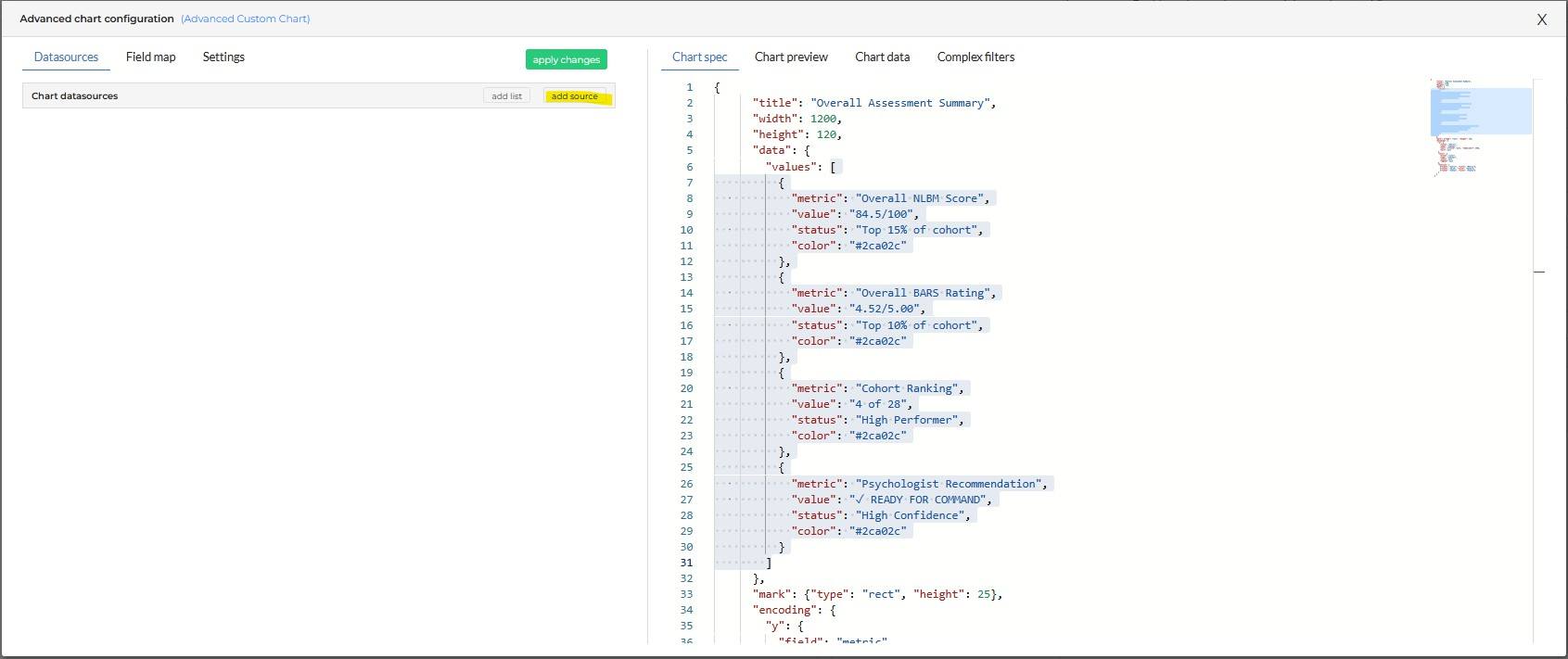
In the Chart Spec window, locate the values array — this is the data section inside
"data": { "values": [ ... ] }Highlight and copy the entire values array including the surrounding brackets
This becomes the static data source you'll configure in the next step.
Step 6: Add a Static Data Source
In the Chart Datasources panel on the left, click Add Source
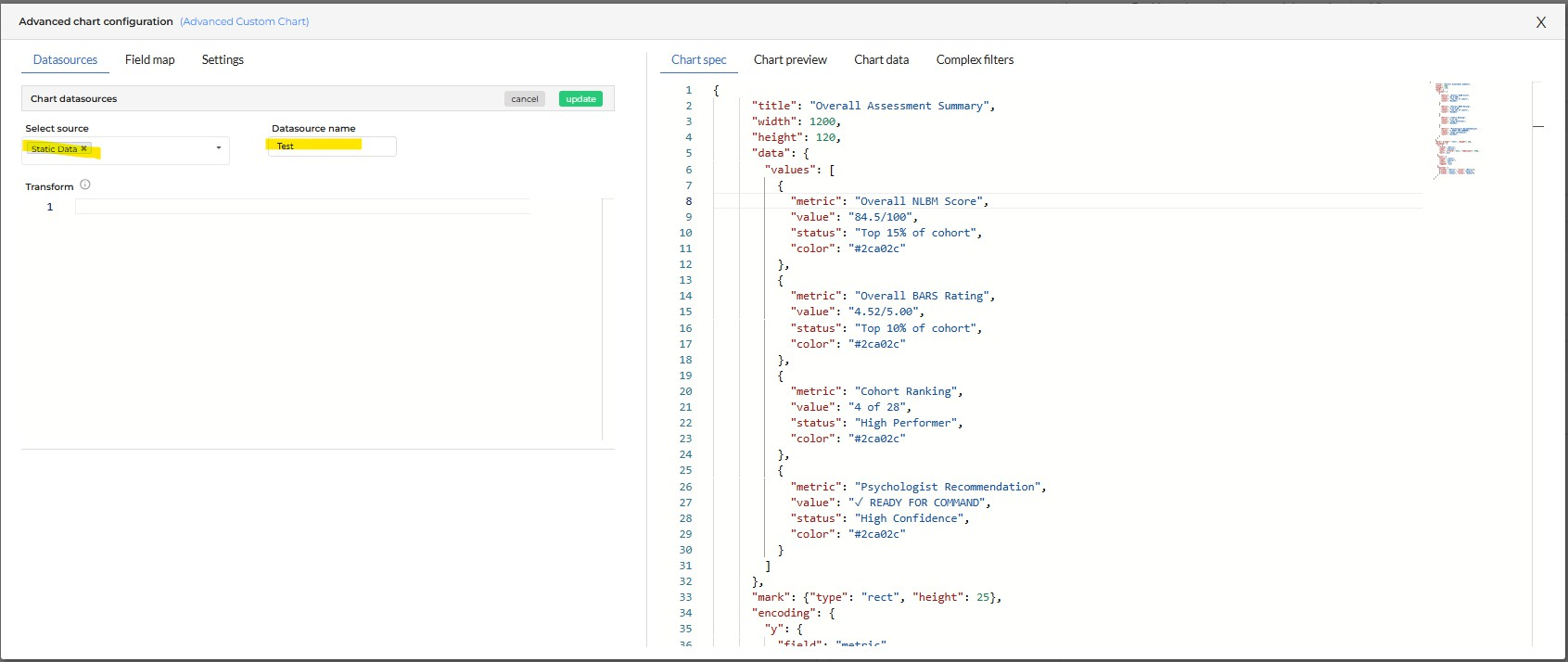
Select Static Data as the source type
Give the datasource a descriptive name — for example, "Program Assessment Data"
Step 7: Paste the Values into the Data Source
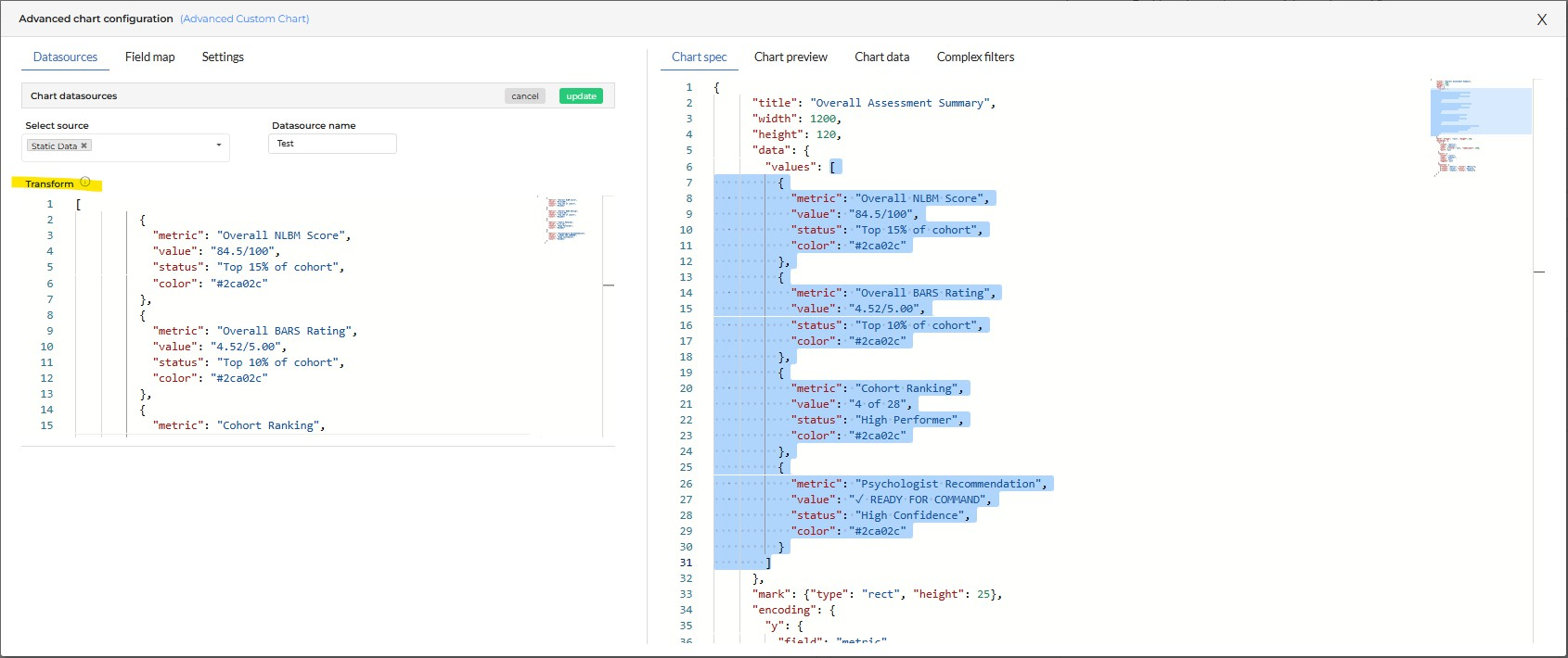
Locate the Transform section within the Static Data configuration
Paste the values array you copied in Step 5 into the Transform field
Step 8: Save the Data Source
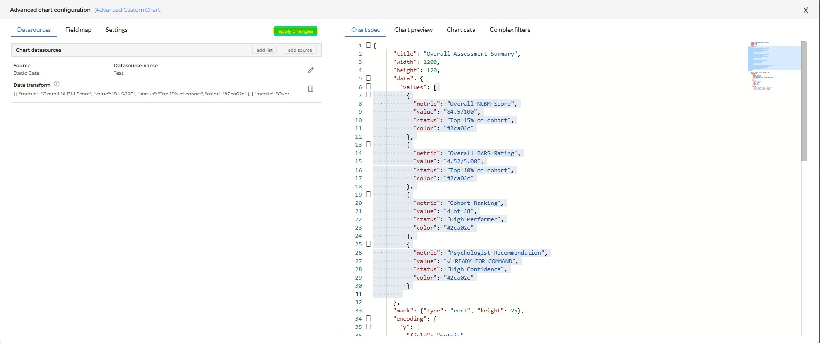
Click Update
Click Apply Changes
This saves the datasource and refreshes the chart configuration.
Step 9: Load the Dashboard
Close the configuration window
Click Load to apply the changes to your SmartBoard layout
Verify that the Advanced Custom Chart renders correctly and your data appears as expected.
Troubleshooting
My chart isn't rendering. Check that the field names in your JSON match exactly what you entered in the Chart Spec and Static Data configuration. A mismatch in field names — including capitalization — will prevent the chart from loading.
My data isn't showing up. Confirm you copied the complete values array in Step 5, including the opening and closing brackets. A partial copy will produce an empty chart.
I want a different chart type. Browse the full Vega-Lite example library at vega.github.io/vega-lite/examples for the chart specification that fits your data. Swap the JSON into the Chart Spec window and repeat Steps 5 through 9.
Tips
Gary can generate Vega-Lite compatible chart specifications on demand. Ask Gary to build a chart for your data and use the output as a starting point for your Advanced Custom Chart configuration.
Modify the color values in the JSON to align with your organization's status coding — green for on track, yellow for at risk, red for delayed.
Save your working JSON externally before making major changes. If a configuration breaks, you'll want the last working version to restore from.
Get Help
Contact your Customer Success Manager or visit the Customer Resource Center for additional support with SmartBoard configuration and Advanced Custom Charts.